


VIDEO: First Time Hearing Phil Collins - IN the Air Tonight Reaction
I think this video is going viral, and for good reason! This is simply fantastic as these two young men hear Phil Collins' In the Air Tonight for the first time. It reminds me how this song was so revolutionary for ALL of us when it first came out. Let the song give you chills all over again for the first time along with these two who are just as moved by it now as we were then. FANTASTIC!!!!!


Friday Links List and Illustrators' Treehouse News - 14 August 2020

From The New York Times: Kathleen Duey, a Mentoring Children’s Book Author, Dies at 69 Rest in peace, dear Kathleen.
From Brightly:
Ain’t Nothing But a Family Thing: Books About All Kinds of Families
6 Tips to Get Your Kids Focused on the New School Year
From BookRiot:
8 INSIGHTFUL PICTURE BOOKS TO HELP KIDS COPE WITH ANXIETY
9 YA FOLKLORE BOOKS FROM AROUND THE GLOBE (Several of these were already on my 'to read' list!)
From The Bookseller: Women's Prize sponsor Baileys launches free Reclaim Her Name series
From HuffPost: Writer Reworks ‘Love You Forever’ To Take Out The Creepy Parts Topher Payne's version of the beloved Robert Munsch book has an important twist.
From Time: Author Angie Thomas on How Books Are Transforming the Next Generation: 'They’re Realizing Their Power'
From the GoodNewsNetwork: Kevin Costner’s New Road Trip App Tells History Stories Tailored Exactly to the Places You Are Driving Through (GREAT idea! Although, it seems like it should be more of a social networking project than a subscription service.)
From SLJ:
Peter Adams Fields Seven Questions About Misinformation and “Fake News”
Fighting the Infodemic: New Strategies for News Literacy
Strategies for Teaching Seven Native-Centered Books to K-12 Students
ILLUSTRATORS' TREEHOUSE NEWS

From SCBWI Carolinas: August Newsletter including news on the Fall Conference (where I'll be speaking)
The Edinburgh Book Festival starts Monday - online and FREE!
From ChildrensIllustrators.com: This month's newsletter with featured illustrators and interviews with publishers, art directors, and editors
Are you familiar with the new creative magazine Uppercase?
From Muddy Colors:
You Don't Suck at Color with Chris Beatrice - GREAT post!
Sunday Skills: Crutches with Tommy Arnold
How to Achieve a Stronger Likeness and What to Memorize for Invention (on portraiture)
10 Things... Color with Greg Manchess
Turning Points: Alphonse Mucha by Lauren Panepinto
From Print and Pattern:
Store Snaps (what's out there in the children's pattern market)
STORE SNAPS - tk maxx / homesense
From Publishers Weekly: Children's Books on 2020 V-P Candidate Kamala Harris
From J.K. Rowling: Winners of The Ickabog Illustration Contest Announced
From Lilla Rogers: New Illustrator Representation Announcement - these are cool, and I have great respect for the job Lilla Rogers is doing. She is one savvy lady!
From The Art Room Plant: Monika Vaicenaviciene

OFF TOPIC BUT INTERESTING
From The Thesis Whisperer: RICH ACADEMIC, POOR ACADEMIC? MAKING AN ACADEMIC LIVING IN COVID TIMES
Rahele Jomepour Bell's OUR FAVORITE DAY OF THE YEAR
Different cultures embrace and celebrate different holidays and events around the year that, while dear to them, might be unknown to other cultures. So, I flipped over Rahele Jomepour Bell's new book, OUR FAVORITE DAY OF THE YEAR, that gives children the opportunity to learn about other people's favorite day of the year. Rahele stopped by to talk about it...

Rahele: When I want to start to make sketches for a story, first I read the whole story, then I write down the main characters of the book in my notebook.
After that, I break down the paragraphs and make the words to the storyboard. Then I begin to draw spreads for my book. For Our Favorite Day of the Year, I sent the storyboard sketches to my publisher, and after I made revisions, my art director asked me to do the characters in color, and I also did a page like as final art. My art director liked it, and I continued with the style that was approved. For the final arts, I made different kinds of textures by using printmaking ink, gouache and acrylic, and printmaking brayer on different types of papers. I scanned the hand-painted textures and collaged them together to make the pictures using digital tools.


Rahele: My favorite day of the year is Nowruz. It means "New Day" in Persian. Persian people in Iran and many other countries celebrate the first day of spring and the vernal equinox as their new year.
On the day or night of Nowruz, everyone takes a shower, clean, and put on the new clothes. Everyone helps to set up the Haft Sin table, which is included seven symbols of spring. Families gather around the table and make wishes for the new year arriving.
Then they exchanged love by hugging and kissing and saying: Nowruz Mubarak.
Next is going to the grandparent's house and visiting the whole family like aunties, uncles, cousins. The best moment I remember was exchanging gifts and taking that crisp bills of money from my grandma that she kept them in her special edition Quran.
e: Is there a unique or funny story behind the creation of Our Favorite Day of the Year?
Rahele: Something is unique for me about creating the characters of this book. I am being inspired by real children who I have met them in the real world. For example, Kevin is very similar to a boy I met in the Unitarian Church in Ames. He had this beautiful red hair tied with a pink hair tie. And I had his image in my mind until he came to my mind when I started to revise this book's characters.

 e: What do you think makes an illustration magical, what I call "Heart Art” - the sort that makes a reader want to come back to look again and again?
Rahele: What I think makes an illustration of a Heart Art is giving love to every small object pictured in that illustration alongside the main characters and the main scene. A picture of a pencil on the table in an artwork needed love while the artist was creating it.
Rahele: As an artist who most the time spending hours and hours in my studio, I love being in social media and stay connected with my people in the bookmaking field. I like both Instagram and Twitter.
Rahele: My most favorite part of being a bookmaker is waiting for the next project coming to my hands! At those moments, I am like a child waiting for the next gift wrapping to be torn! The challenging part is waiting to see your book to be born. That is a long time of waiting! Being patient is a challenge!
Rahele: This book has lots of layers of concepts. It is not just about holidays or religious. It is about appreciating each other's lifestyle! It is about friendship, it is about we all are human, and we all love the texture of our different cultures, foods, celebrations.
Rahele: I am about to finish my third book’s final artwork. My next book will be: Book’s Big Adventure, and I can’t wait to share it with the world; written by Adam Lehrhaupt, publisher: Paula Wiseman Books.
My dream project is to create a good picture book with my name on its cover as an author/illustrator.
e: Thank you, Rahele!
Rahele: This is how I make my hand painted textures: https://www.instagram.com/p/B3XqH9WgG9k/
And these are characters of the book in the very early stages:


I am participating in the BookShop Affiliate Program. This program pays bloggers a small percentage of each purchased book from a post. But the best part is, purchases are fulfilled by bookstores near you, thereby, helping to keep your local bookstores afloat too! It's good for everyone! Click the book cover to purchase this title through Bookshop.
Rahele: When I want to start to make sketches for a story, first I read the whole story, then I write down the main characters of the book in my notebook.
After that, I break down the paragraphs and make the words to the storyboard. Then I begin to draw spreads for my book. For Our Favorite Day of the Year, I sent the storyboard sketches to my publisher, and after I made revisions, my art director asked me to do the characters in color, and I also did a page like as final art. My art director liked it, and I continued with the style that was approved. For the final arts, I made different kinds of textures by using printmaking ink, gouache and acrylic, and printmaking brayer on different types of papers. I scanned the hand-painted textures and collaged them together to make the pictures using digital tools.
Rahele: My favorite day of the year is Nowruz. It means "New Day" in Persian. Persian people in Iran and many other countries celebrate the first day of spring and the vernal equinox as their new year.
On the day or night of Nowruz, everyone takes a shower, clean, and put on the new clothes. Everyone helps to set up the Haft Sin table, which is included seven symbols of spring. Families gather around the table and make wishes for the new year arriving.
Then they exchanged love by hugging and kissing and saying: Nowruz Mubarak.
Next is going to the grandparent's house and visiting the whole family like aunties, uncles, cousins. The best moment I remember was exchanging gifts and taking that crisp bills of money from my grandma that she kept them in her special edition Quran.
e: Is there a unique or funny story behind the creation of Our Favorite Day of the Year?
Rahele: Something is unique for me about creating the characters of this book. I am being inspired by real children who I have met them in the real world. For example, Kevin is very similar to a boy I met in the Unitarian Church in Ames. He had this beautiful red hair tied with a pink hair tie. And I had his image in my mind until he came to my mind when I started to revise this book's characters.
e: What do you think makes an illustration magical, what I call "Heart Art” - the sort that makes a reader want to come back to look again and again?Rahele: What I think makes an illustration of a Heart Art is giving love to every small object pictured in that illustration alongside the main characters and the main scene. A picture of a pencil on the table in an artwork needed love while the artist was creating it.
Rahele: As an artist who most the time spending hours and hours in my studio, I love being in social media and stay connected with my people in the bookmaking field. I like both Instagram and Twitter.
Rahele: My most favorite part of being a bookmaker is waiting for the next project coming to my hands! At those moments, I am like a child waiting for the next gift wrapping to be torn! The challenging part is waiting to see your book to be born. That is a long time of waiting! Being patient is a challenge!
Rahele: This book has lots of layers of concepts. It is not just about holidays or religious. It is about appreciating each other's lifestyle! It is about friendship, it is about we all are human, and we all love the texture of our different cultures, foods, celebrations.
Rahele: I am about to finish my third book’s final artwork. My next book will be: Book’s Big Adventure, and I can’t wait to share it with the world; written by Adam Lehrhaupt, publisher: Paula Wiseman Books.
My dream project is to create a good picture book with my name on its cover as an author/illustrator.
e: Thank you, Rahele!
Rahele: This is how I make my hand painted textures: https://www.instagram.com/p/B3XqH9WgG9k/
And these are characters of the book in the very early stages:
I am participating in the BookShop Affiliate Program. This program pays bloggers a small percentage of each purchased book from a post. But the best part is, purchases are fulfilled by bookstores near you, thereby, helping to keep your local bookstores afloat too! It's good for everyone! Click the book cover to purchase this title through Bookshop.
Coloring Page Tuesday - Silly Dog
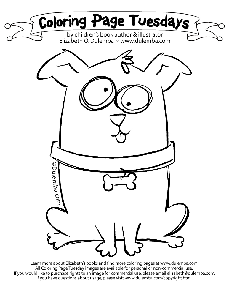
CLICK HERE for more coloring pages.
Remember, I create my coloring pages to draw your attention to my books!
 For instance, I'm celebrating the new illustrated (by me) edition of A BIRD ON WATER STREET! My debut novel won me "Georgia Author of the Year!"
Booklist said it's "A book deserving of a wide readership, recommended for all libraries."
If my news and images add value to your life, won't you please

Just love this one image? Consider a one-time donation...

I create my coloring pages for teachers, librarians, booksellers, and parents to enjoy for free with their children, but you can also purchase rights to an image for commercial use, please contact me. If you have questions about usage, please visit my Angel Policy page.
VIDEO: New e's art tips!
I've been busy making more e's art tips tutorials as supplements to the online teaching I'll be doing this fall. Who wins? You do! Go have a look at How to Draw Children - click the image to watch on Youtube.
and
Drawing with Bubbles and Boxes...
And do please subscribe! I need 1,000 subscribers to be able to monetize my Youtube Channel - thanks!
and
Drawing with Bubbles and Boxes...
And do please subscribe! I need 1,000 subscribers to be able to monetize my Youtube Channel - thanks!
Victory Walks
Stan and I have increased our walking lately - trying to lose the "Covid 15(lbs.)" so many of us have succumbed to. I swear I want to buy stock in Weight Watchers. Or a work-out clothing company - I've purchased some new workout clothes too. At any rate, one of our walk directions takes us to the lovely Glencairn Gardens. I've shared photos from the garden before. Well, it changes with the seasons. This time, the crops are coming in from the Victory Garden.


e's moment of peas
I've created yet another little corner of the internet to occupy. This time, I'm calling it "e's moment of peas!" This one is a wee waterfall at Glencairn Gardens here in Rock Hill, South Carolina. I don't know how often I'll get to post these, but I'll share when I can. Click the image to enjoy on Youtube:

Interview with... ME!

Friday Links List and Illustrators' Treehouse News - 7 August 2020
From BookBub: 50 of the Best Books to Read in Your 20s Interesting list!
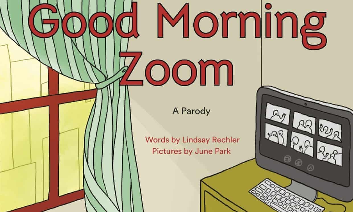
From The Guardian: Goodnight Moon redrawn as Good Morning Zoom for Covid-era kids
From BookRiot: 8 OF THE BEST YA BOOKS SET IN POST-APOCALYPTIC CITIES
From The Bookseller: Rosen and Blake team up for poems on migration
From Nathan Bransford: How to Spice Up Relationships in Novels
From Topher Payne: the tree who set healthy boundaries: an alternate ending for Shel Silverstein's "The Giving Tree"
From the NYT: Stephenie Meyer Is Telling Edward’s Story, Even if It Makes Her Anxious
From SLJ:
Vote of Confidence: When It Comes to Teaching the 2020 Election, Educators Have a Plan
RevolTeens: Helping Teens Through Revolting Times, by Christine Lively
Morgan’s Mumbles: Healthy Habits, by teen contributor Morgan Randall
From PW - Covid affects on the industry are now coming in.
Simon & Schuster is looking up: S&S Posts Q2 Profit Gain Despite Sales Decline
While HMH is not doing as well: Sales at HMH Took Big Hit in Q2
Here's the state of HarperCollins: Sales, Earnings Down at HC in Fiscal 2020
ILLUSTRATORS' TREEHOUSE NEWS
Note: Paperlike iPad covers are again available (the pandemic threw off production and shipping). I LOVE mine!
From Yahoo!Life: Black cartoonist's work on race relations and coronavirus prompted newspapers to drop it: 'I am being silenced over white feelings'
From TikTok: This 20-year-old college student made a stunning TikTok video that shows him transforming into superheroes using special effects he created himself. Hollywood is paying attention. Watch HERE
From Urban Sketchers: August Newsletter
From CommArts: They are holding their annual type competition (this includes hand-lettering projects) - students are welcome! See last year's winners here.
From Muddy Colors:
Running with Both Legs
SCOTT FISCHER PAINTS ‘FORCE OF WILL’ (demo)
Dynamic Resources (Check out Sergio Toppi - OMG!)
The Goal Folder This is a GREAT idea - I plan to do this!
From Yahoo!News: From 'Wild Horses' to 'Wild Things,' a window into Maurice Sendak's creative process
From The Art Room Plant: Last

OFF TOPIC BUT INTERESTING
From The NYT: John Lewis' last words to us: Together, You Can Redeem the Soul of Our Nation Though I am gone, I urge you to answer the highest calling of your heart and stand up for what you truly believe.
Rob Dunlavey’s IN THE WOODS
One thing I'm not getting enough of during this lock-down is nature. So, I flipped over Rob Dunlavey's IN THE WOODS. He stopped by to talk about it...

e: What was your creative process/medium for In The Woods? Can you walk us through it?
Rob: My process seems to change with each book that I do. For In the Woods, I began by determining the page breaks and blocking out the poems in a digital layout. My initial sketches were painted digitally. These designs were further explored in pencil and digitally colored and placed into the layout. I then worked up a few sample spreads in watercolor and multi-media. Once I received approval, I started painting the illustrations in a combination of watercolor, ink, colored pencil, pastel and collage. Some spreads went through many sketches. Final delivered files often included digital editing and additions.
I think most illustrators would agree that the hardest creative work is at the beginning when you’re trying to understand what type of book you, the author (the wonderful David Elliott), and the publisher (the equally marvelous Candlewick Press) hope to bring to market. In the Woods is the sixth in a series of poetry picture books by David and Candlewick Press. I was struck most of all by the first three books in the series, which were illustrated by Holly Meade, who died in 2013.

I detected, maybe projected, a deep creative love and respect in these titles. Would I be able to fill those shoes with my turn on In the Woods? Two other books in the series were ably illustrated by Rebecca Stadtlander and Matthew Trueman, but there just seemed to be a different vibe surrounding the books illustrated by Holly. So I felt compelled, and that is probably step number one in anything worth doing!

Heather McGee, the book’s designer and art director, emailed me the text, and we discussed the page size and other creative choices. I was dying to know: Why me? Candlewick had seen my previous book for Schwartz & Wade, Owl Sees Owl, and they liked my sympathetic forest and animal illustrations.
There’s great freedom in turning the pages of a book, especially a picture book like this where each spread is a standalone experience. I wanted In the Woods to also have a narrative arc from the endpapers and title page to the informational back matter. I spent a long time rearranging the order of the poems. The original order was good, but it didn’t suggest a story to me (it was a collection of poems, after all!). After tinkering a bit, I was able to layer into the flow a story of the seasons with a hint of the ways different animals and their habits are related. A few of the animals are elusive predators, while others are common in many suburban backyards. I wanted to weave all that together. The animals in the woods are different, but they are also our neighbors; a respectful curiosity is requisite. This stance seemed in sync with David’s verse.
Once my new page order was approved, I began sketching in earnest. Rather than sketching in pencil, I made rapid digital paintings in Photoshop for the first round of sketches and put them in my digital dummy. I continued to tinker with the page order.


I moved the bear to the opening spread and explored how to paint it. It’s always a scary leap starting any project. I printed out my sketch at 100 percent (approximately 20 x 12ʺ) and loosely transferred it to my watercolor paper. I like watercolor to block out the basics. In the end, I used all types of materials to finish the illustrations: pastel, ink, collage, colored pencil. And once I was in final, final production mode, Photoshop came to the rescue several times. But I prefer analog originals as much as possible.

The bear: watercolor, ink, charcoal, colored pencil, collage, latex paint
In my subsequent drafts, I resketched in pencil and added approximate digital colors. Here we see the scarlet tanager flying through the new spring forest. Life in the woods (besides the bears) has woken up.

This is the final scarlet tanager painting. I sweated over the forest painting and getting the reflections and the lush plant growth the way I wanted. The bird was a problem. I painted it several times, but it didn’t “flash.” Eventually I used a digital sketch of the scarlet tanager layered on top of my landscape.
The original moose sketch/painting was effective and graphic, but it needed to be rendered like the other illustrations. Stylistic doors close and open through the phases of making a book. You pretend that things are locked in place as you journey, but changing something in one place can effect something in another place.

I liked this sketch of the ungainly baby moose, but we wanted to show more context. That also allowed me to suggest the change from summer to autumn. See below:

There were a few other spreads that presented a similar evolution. Often they were good, but just not right. The illustration must be redone, or perhaps other spreads have to be adjusted. The intangible visual elements, similar to the interplay of David Elliott’s word choices, are what create a beautiful fabric out of interwoven threads.
The penultimate poem is about raccoons. I wanted to describe an animal that goes about its business but is aware that winter is coming and how we all must cope. There’s a small stream near my home that I imagined would be a good place for this pair of raccoons. I see their footprints in the mud when I walk through the forest. Below is my original sketch. It’s really just a placeholder.


Above: half-size pencil sketch with Photoshop color added.
The final spread in watercolor and mixed media. I used Photoshop for the snowflakes.

The cover: I suggested several different cover ideas, but we decided to reuse the raccoon, which I painted a second time but with green summer vegetation. Here is the cover layout; all it needed was a new illustration!

The final jacket art: I fussed, we even fussed as a committee, over the whiskers and getting the raccoon’s expression just right: familiar yet feral, too.

The other pages of the book: the endpapers, the title page spread, the back matter/author’s notes were all fussed over to maintain the universe of the book, the flow of the seasons, and the comforting intimacy of a forest.
This is dear to my heart and forms a deep artistic response to the natural world I seek out every day. I have hundreds, maybe thousands of drawings of the animals, forest, and river near my home. For about the past ten years, I’ve ventured out every morning in the rain, sun, snow, and cold to draw nature. I post those drawings online at www.robd.com/observations. I feel so fortunate to have this resource so close to me.
e: What was your path to publication?
Rob: I grew up on Disney cartoons (Snow White and the Seven Dwarfs and Pinocchio are my favorites), comic books, Mad magazine, and the editorial cartoons by Bill Mauldin and Herb Block I would read in the Chicago newspapers. I was the “class artist” all through school, but in college, instead of illustration I studied fine art (painting, printmaking, and sculpture). In the mid-1980s I moved to Los Angeles and pursued an MFA in sculpture.
My illustration career began after graduate school, when I moved to the Boston area. I had always drawn cartoons and loved to draw; surely people would value that enough (and pay me) to make a living? I loved and was interested in children’s books but was clueless at the time. Instead, after enough rejections from fortunately uncharitable publishers, I spent years making illustrations for newspapers, magazines, and textbooks. After the 9/11 attacks, the editorial illustration market shrank drastically, and I had more time to explore my fine art side, my personal ideas, and different ways of painting. This woodshedding engendered a body of work that actually looked like a picture book illustration portfolio.
I felt confident in it, too. Eventually this led to a few jobs overseas for Bayard Presse in Paris and my first American book, The Dandelion’s Tale written by Kevin Sheehan for Schwartz & Wade. I’ve done three books for Schwartz & Wade. My most recent, Owl Sees Owl written by Laura Godwin, received the 2016 Bull-Bransom Award from the National Museum of Wildlife Art.

e: Is there a unique or funny story behind the creation of In The Woods?
Rob: There’s a spread about halfway through the book about a fisher cat, which is a carnivorous mammal. Think of a weasel on steroids that hasn’t had a shower or a meal in about two weeks. They’re fascinating and elusive creatures in the woods near me. Farther north, they are known to dine on fresh porcupine! Anyway, I fretted about this painting. The sketches looked promising and got the green light, but the painting turned to mud every time I tackled it. No explanations. I needed a new idea as the deadline was approaching. Fortunately, because of my regular sketching practice, I had actually seen a fisher cat stalking some ducks in the river one winter day several years ago. Maybe that could work.

Initial digital sketch

Pencil sketch with digital color

First final attempt: This isn’t working!

The final illustration that appears in the book
As I said, this view was based on an actual sighting at a place near and dear to my heart. This willow tree is growing in the middle of the Charles River. I’ve drawn it many times, and it brings me pleasure. I didn’t send a sketch to Candlewick; I just proposed the new painting as a solution to a vexing problem. Luckily they agreed—or maybe they simply assented because they had other more pressing issues.

Here’s a recent drawing of the willow tree.
And a photo I took today.

Studio pictures: My interns:

The bobcat (WIP)

The moose and millipede in progress

e: What do you think makes an illustration magical, what I call “heart art,” the sort that makes a reader want to come back to look again and again?
Rob: That is a great question. From an illustrator’s perspective, I think such a picture would have to reveal or reinforce a central aspect of the main character’s emotional state or the thing that challenges them. There are so many ways to interpret this! The “character” could be a static, nonhuman concept. The character could be a statement of fact about one’s day. The moment or the mental state needs to reflect something that already resides in the reader’s actual or imagined experience. Maybe we could spend a few hours discussing this over drinks!
e: Would love to! How do you advertise yourself (or do you)?
Rob: I used to do a lot more: postcards and directory pages several times a year. In 2012 I joined Pippin Properties, Inc., a literary agency for author and artists in New York. Holly McGhee, Elena Giovinazzo, and the Pippin staff shop my portfolio to prospective publishers. I actively post my personal work through social media (instagram, tumbler, and flickr) and try to exhibit my work a few times a year.
e: What is your favorite or most challenging part of being a creator?
Rob: What’s lovely and challenging is existing between the limitless potential of a life of making art and the tension of wanting it to amount to something that the world will value. I enjoy my early morning hours just before the sun gets up. I have all my tools in front of me, ready. My sketchbook is open, ready to embark on a new small exploration. Definitely coffee is present, and some music is just barely audible poking into the dawn soundscape, keeping my mind hopeful and flexible. What a nice part of every day to make happen.
e: Indeed! Is there something in particular about In The Woods you hope readers will take away with them, perhaps something that isn’t immediately obvious?
Rob: I think the book attempts to slow a reader down in order to find a home, briefly, outside of themselves. And into the space while contemplating Nature, wordplay can arise that lays claim to the power of imagination to create relationships that matter. Hornets? Millipedes? Moose and bears are all outside of human experience, but with our imaginations we become kin.
e: That's exactly what I love about it. What are you working on next or what would be your dream project?
Rob:

I’m always working on something. My studio is filled with stacks and shelves of sketchbooks that entail daily creation and curation. There are picture book stories I labor over in a frustratingly undisciplined fashion. I really need to knuckle down; bringing a few of them to market would be a dream project.
Some of your readers might be curious about my series of paintings of whimsical colorful buildings I call “Crystal Cities” (https://www.robd.com/crystal-cities-1, flickr). I have a ton of projects!
e: FABULOUS! Thanks Rob! I hope to have you back again soon.
IN THE WOODS. Text copyright © 2020 by David Elliott. Illustrations copyright © 2020 by Rob Dunlavey. Reproduced by permission of the publisher, Candlewick Press, Somerville, MA.
Rob: My process seems to change with each book that I do. For In the Woods, I began by determining the page breaks and blocking out the poems in a digital layout. My initial sketches were painted digitally. These designs were further explored in pencil and digitally colored and placed into the layout. I then worked up a few sample spreads in watercolor and multi-media. Once I received approval, I started painting the illustrations in a combination of watercolor, ink, colored pencil, pastel and collage. Some spreads went through many sketches. Final delivered files often included digital editing and additions.
I think most illustrators would agree that the hardest creative work is at the beginning when you’re trying to understand what type of book you, the author (the wonderful David Elliott), and the publisher (the equally marvelous Candlewick Press) hope to bring to market. In the Woods is the sixth in a series of poetry picture books by David and Candlewick Press. I was struck most of all by the first three books in the series, which were illustrated by Holly Meade, who died in 2013.
There’s great freedom in turning the pages of a book, especially a picture book like this where each spread is a standalone experience. I wanted In the Woods to also have a narrative arc from the endpapers and title page to the informational back matter. I spent a long time rearranging the order of the poems. The original order was good, but it didn’t suggest a story to me (it was a collection of poems, after all!). After tinkering a bit, I was able to layer into the flow a story of the seasons with a hint of the ways different animals and their habits are related. A few of the animals are elusive predators, while others are common in many suburban backyards. I wanted to weave all that together. The animals in the woods are different, but they are also our neighbors; a respectful curiosity is requisite. This stance seemed in sync with David’s verse.
Once my new page order was approved, I began sketching in earnest. Rather than sketching in pencil, I made rapid digital paintings in Photoshop for the first round of sketches and put them in my digital dummy. I continued to tinker with the page order.
The bear: watercolor, ink, charcoal, colored pencil, collage, latex paint
The original moose sketch/painting was effective and graphic, but it needed to be rendered like the other illustrations. Stylistic doors close and open through the phases of making a book. You pretend that things are locked in place as you journey, but changing something in one place can effect something in another place.
The penultimate poem is about raccoons. I wanted to describe an animal that goes about its business but is aware that winter is coming and how we all must cope. There’s a small stream near my home that I imagined would be a good place for this pair of raccoons. I see their footprints in the mud when I walk through the forest. Below is my original sketch. It’s really just a placeholder.
Above: half-size pencil sketch with Photoshop color added.
This is dear to my heart and forms a deep artistic response to the natural world I seek out every day. I have hundreds, maybe thousands of drawings of the animals, forest, and river near my home. For about the past ten years, I’ve ventured out every morning in the rain, sun, snow, and cold to draw nature. I post those drawings online at www.robd.com/observations. I feel so fortunate to have this resource so close to me.
e: What was your path to publication?
Rob: I grew up on Disney cartoons (Snow White and the Seven Dwarfs and Pinocchio are my favorites), comic books, Mad magazine, and the editorial cartoons by Bill Mauldin and Herb Block I would read in the Chicago newspapers. I was the “class artist” all through school, but in college, instead of illustration I studied fine art (painting, printmaking, and sculpture). In the mid-1980s I moved to Los Angeles and pursued an MFA in sculpture.
My illustration career began after graduate school, when I moved to the Boston area. I had always drawn cartoons and loved to draw; surely people would value that enough (and pay me) to make a living? I loved and was interested in children’s books but was clueless at the time. Instead, after enough rejections from fortunately uncharitable publishers, I spent years making illustrations for newspapers, magazines, and textbooks. After the 9/11 attacks, the editorial illustration market shrank drastically, and I had more time to explore my fine art side, my personal ideas, and different ways of painting. This woodshedding engendered a body of work that actually looked like a picture book illustration portfolio.
I felt confident in it, too. Eventually this led to a few jobs overseas for Bayard Presse in Paris and my first American book, The Dandelion’s Tale written by Kevin Sheehan for Schwartz & Wade. I’ve done three books for Schwartz & Wade. My most recent, Owl Sees Owl written by Laura Godwin, received the 2016 Bull-Bransom Award from the National Museum of Wildlife Art.
Rob: There’s a spread about halfway through the book about a fisher cat, which is a carnivorous mammal. Think of a weasel on steroids that hasn’t had a shower or a meal in about two weeks. They’re fascinating and elusive creatures in the woods near me. Farther north, they are known to dine on fresh porcupine! Anyway, I fretted about this painting. The sketches looked promising and got the green light, but the painting turned to mud every time I tackled it. No explanations. I needed a new idea as the deadline was approaching. Fortunately, because of my regular sketching practice, I had actually seen a fisher cat stalking some ducks in the river one winter day several years ago. Maybe that could work.
Initial digital sketch
Pencil sketch with digital color
First final attempt: This isn’t working!
The final illustration that appears in the book
And a photo I took today.
Studio pictures: My interns:
e: What do you think makes an illustration magical, what I call “heart art,” the sort that makes a reader want to come back to look again and again?Rob: That is a great question. From an illustrator’s perspective, I think such a picture would have to reveal or reinforce a central aspect of the main character’s emotional state or the thing that challenges them. There are so many ways to interpret this! The “character” could be a static, nonhuman concept. The character could be a statement of fact about one’s day. The moment or the mental state needs to reflect something that already resides in the reader’s actual or imagined experience. Maybe we could spend a few hours discussing this over drinks!
e: Would love to! How do you advertise yourself (or do you)?
Rob: I used to do a lot more: postcards and directory pages several times a year. In 2012 I joined Pippin Properties, Inc., a literary agency for author and artists in New York. Holly McGhee, Elena Giovinazzo, and the Pippin staff shop my portfolio to prospective publishers. I actively post my personal work through social media (instagram, tumbler, and flickr) and try to exhibit my work a few times a year.
e: What is your favorite or most challenging part of being a creator?
Rob: What’s lovely and challenging is existing between the limitless potential of a life of making art and the tension of wanting it to amount to something that the world will value. I enjoy my early morning hours just before the sun gets up. I have all my tools in front of me, ready. My sketchbook is open, ready to embark on a new small exploration. Definitely coffee is present, and some music is just barely audible poking into the dawn soundscape, keeping my mind hopeful and flexible. What a nice part of every day to make happen.
e: Indeed! Is there something in particular about In The Woods you hope readers will take away with them, perhaps something that isn’t immediately obvious?
Rob: I think the book attempts to slow a reader down in order to find a home, briefly, outside of themselves. And into the space while contemplating Nature, wordplay can arise that lays claim to the power of imagination to create relationships that matter. Hornets? Millipedes? Moose and bears are all outside of human experience, but with our imaginations we become kin.
e: That's exactly what I love about it. What are you working on next or what would be your dream project?
Rob:
Some of your readers might be curious about my series of paintings of whimsical colorful buildings I call “Crystal Cities” (https://www.robd.com/crystal-cities-1, flickr). I have a ton of projects!
e: FABULOUS! Thanks Rob! I hope to have you back again soon.
IN THE WOODS. Text copyright © 2020 by David Elliott. Illustrations copyright © 2020 by Rob Dunlavey. Reproduced by permission of the publisher, Candlewick Press, Somerville, MA.
Subscribe to:
Posts (Atom)