I am a huge fan of
Eliza Wheeler's work, so am absolutely thrilled she was able to spare some time from her very busy schedule to stop by and share her creative process with us today. Happy reading!
Eliza Wheeler on Method I have illustrations in two books that came out in August; the first is a picture book by Varsha Bajaj, THIS IS OUR BABY, BORN TODAY, and the second is a middle-grade novel by Kate Milford, THE LEFT-HANDED FATE.

These two books couldn’t be more different! THIS IS OUR BABY, BORN TODAY is a bright, sweet book celebrating the first day in the life of a baby elephant, with all the jungle family and friends welcoming him into the world. THE LEFT-HANDED FATE is a nautical adventure set during the war of 1812, when three teenagers land on a mysterious island city to search for pieces to a weapon that could change the fate of the world.
Since I started illustrating full time, about half the books that I illustrate are picture-books, the other half are middle-grade novels. It’s a great balance of work that’s bright and sweet, and dark and more mature. I’ve experienced distinct differences illustrating for both formats that I’d love to share with fans of the children’s book genre. For simplicity’s sake, my examples are traditionally formatted middle-grade novels and picture books. But, it’s worth mentioning that there have been a growing number of highly-illustrated middle grade novels and chapter books these days (for example, THE INVENTION OF HUGO CABRET and other Brian Selznick novels), which is exciting for both illustrators and kids resistant to books without pictures (which I is how I was as a kid).
FORMAT
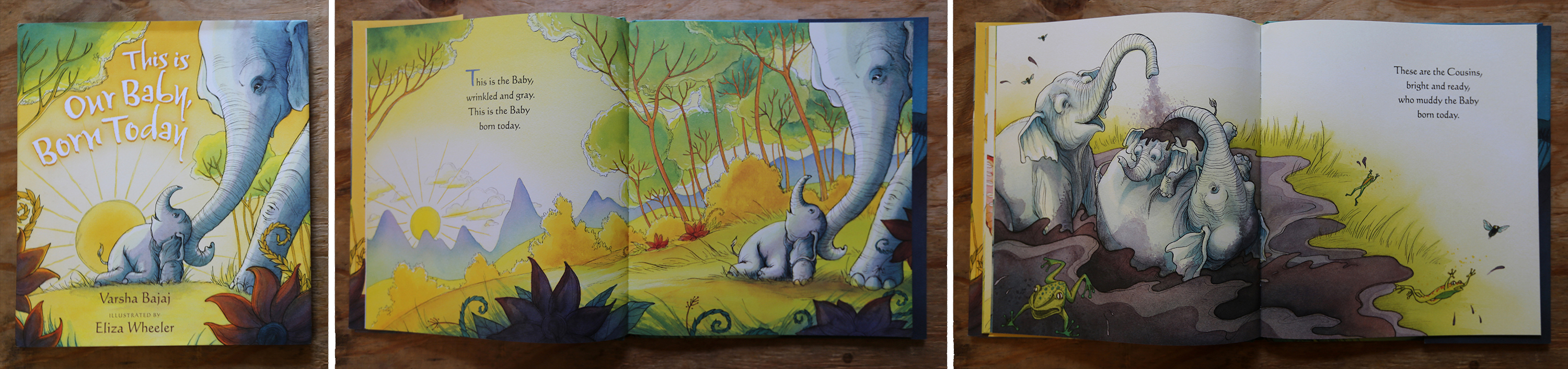
Picture Books: Typically consist of 32 full color pages, with every spread of the book covered in artwork. The text and artwork share page space. The size of the book is often somewhere around 9”x11” (closed), which means that the physical paintings are larger in size. (I work at 100% to the print size.)

Click the image to see a larger version in a new window.
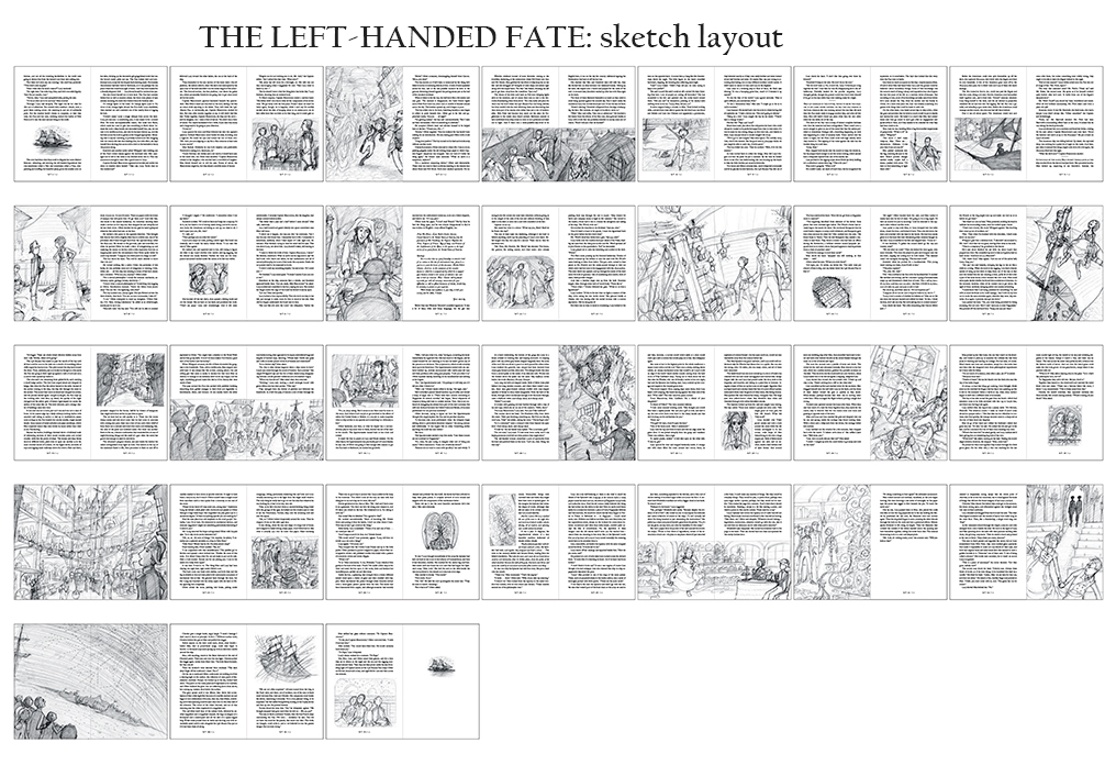
Middle Grades: Vary in length, but are usually a hundred to several hundred pages long. Occasional illustrations supplement the text throughout (typically one image per chapter; sometimes less, sometimes more). The book size also varies, but they are often around 5.5”x8” (closed), and the illustrations are a mix of black and white full page and spot illustrations laid out separately from the text. For THE LEFT-HANDED FATE, I also created a few illustrations that cover an entire wordless spread. The physical paintings are much smaller than picture book artwork.
 VISUAL FUNCTION and FLOW
Picture Books:
VISUAL FUNCTION and FLOW
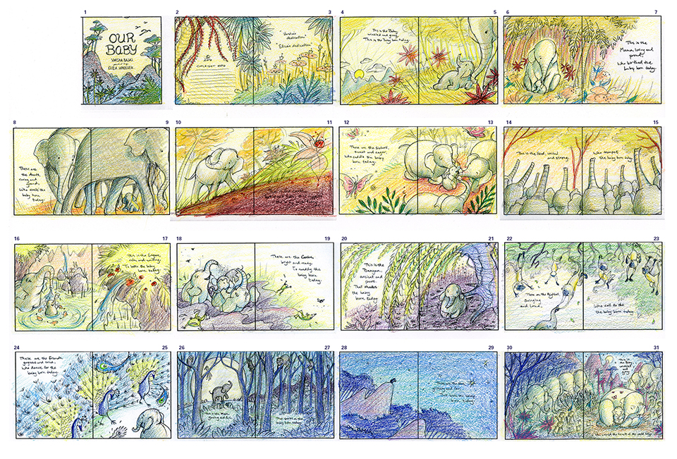
Picture Books: The words and pictures play their own equally important roles in telling the story. The visuals flow from page to page, and need to have rhythm, cohesion in characters and colors, and variety in compositions. The way that the pages are strung together is as important as creating singular successful images. I begin every picture book by working first on storyboards to get a sense of how all these elements are flowing together. In THIS IS OUR BABY, BORN TODAY, the book begins in the morning and ends at night, so I used these storyboards to plan how the colors would flow as well.

Click the image to see a larger version in a new window.
Middle Grades: The words are the main vehicle for the story, while the images work as stand-alone scenes sprinkled throughout the text. They’re less about telling the story, and more about giving little windows into the world the author has described. While the images’ relationships to each other are not as important, what is important is that they correctly correspond with the scenes in the text.

Click the image to see a larger version in a new window.
CONTENT
Picture Books: The child audience is usually ages 3-7, and so the child characters in the book should be somewhere around that age, too. Picture books have another important audience—the adult who’s reading the book aloud to the child. When I create the artwork, I’m hoping that it will appeal in some way to both of these audiences. Generally, picture book artwork is sweet, colorful, and playful.
Middle Grades: The audience here is generally in the 8-12 year-old range, so the characters in the book are often in that age range as well. I’ve had to study visual differences between kids that are 5, 8, and 12. I seem to naturally draw 5 year-olds and 80 year-olds. Anything in between takes some work! As with the writing style and topics of middle-grades, the artwork is often darker and more mature.
 SCHEDULE and PAY
Picture Books:
SCHEDULE and PAY
Picture Books: Have longer schedules; I typically need a year for sketches, revisions, and final artwork. The art deadline is 1 year from the publication date, so if a book is going to be published in the spring, the artwork is due the previous spring. As for pay, advances for picture books are higher than middle grades, and as the illustrator, the royalty earnings are split equally with the author (generally 5% for each).
Middle Grades: The sketching process can stretch out over months (or years) due to the editorial process between the writer and editor, and I find with novels there’s a lot more “hurry up and wait” time involved. Once the sketches are approved, the time to create the final artwork is much shorter than for picture books, usually a couple months, and it happens closer to the publication date. The pay for middle grade artwork is lower than picture book work as well, and for books with minimal illustrations it’s rare to get royalties for the work. For the novels like THE LEFT-HANDED FATE, with a high quantity of drawings, the illustrator usually gets a small royalty.

Click the image to see a larger version in a new window.
WORKING PROCESS

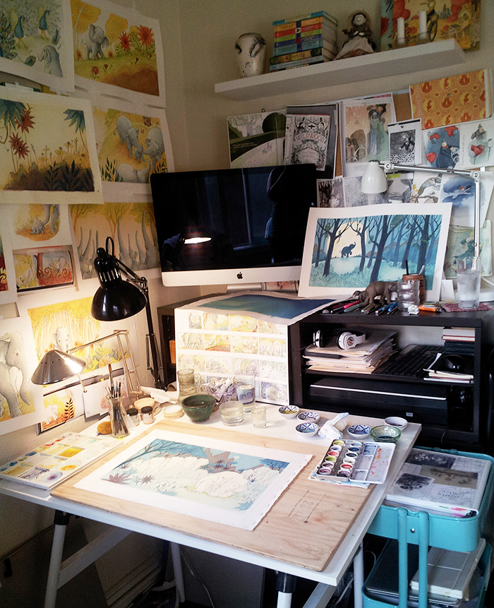
The difference between working on large full-color paintings and smaller grayscale paintings is a big one. With grayscale painting, the biggest focus is on tone and contrast. With full-color art, there are so many more decisions to be made about color palette, saturation, brightness, contrast, etc. As a result, I find working on a picture book to be a more immersive, all-consuming process. I try to keep my schedule completely free of other work during the last months on picture book final artwork, and often I’m exhausted, physically and creatively, when finished. Since middle grade books are less labor intensive, the work is often refreshing coming after months on picture book art. That said, the immersive quality of a picture book is thrilling, and creates an emotional bond with the world and characters that’s intrinsically rewarding.
I love creating bright, sweet artwork for very young readers, and dark, magical art for older audiences. The differences in these formats are what make them a perfect balance of projects for me.
Thanks so much to Elizabeth for inviting me to share about this work with everyone!
Thank YOU Eliza! - e


 my debut novel, A BIRD ON WATER STREET - winner of six literary awards. Click the cover to learn more!


 The other day I had the pleasure of talking to a book club right in the heart of where my novel, A BIRD ON WATER STREET takes place at the gateway to the Blue Ridge Mountains (Appalachia). When the book came out, I made it my policy to Skype with folks in Fannin County and Polk County for free. Because I leaned on so many of them to share their stories and history with me, it was the least I could do. Here was the announcement in the Blue Ridge newspaper.