Random Wonderfulness at The Mint Museum

Vicky and I really did try to see everything at The Mint, and we almost did! There were some truly wonderful exhibits and pieces that don't really fall into a particular category, so I'll include some of those here. For instance, The Mint had a Warhol Marilyn on loan - wow!
And a Norman Rockwell.
I saw an exhibit of his work when I was a kid at the High Museum in Atlanta. It was so nice to be able to get an up-close and personal look at a Warhol now, as a more (*ahem*) mature artist.
I mean, look at those brush strokes!
There was an Kehinde Wiley piece ("Philip the Fair") that simply blew my mind. The museum had a sign encouraging museum goers to strike the same pose as the picture to share on social media, so here I am.
I also flipped over this screen print with diamond dust of Nina Simone by Russell Young.
Vicky was quite excited to see the Romare Bearden exhibit as it was recently at the Carlos Museum at Emory/Atlanta, where she is a docent. They had the work-in-progress for his "Sirens"...
and the finished piece.
I especially liked that they showed his linoleum cuts with the print and the substrate alongside it.
They also had a biography on the man in the gift shop.
There was jewelry too, like this chain of silver orbs by Evert Nijland. It's silver-plated, hand-blown glass. Can you imagine!?
I also loved this "Honey-Suckle Torque" by Heather White van Stolk.
Although, probably my fave of the entire show was this "Bubble Wrap" by Courtney Starett. Isn't this fabulous?
There were two sculptures that resonated with me. One was "Continuum" by Thomas Campbell. I wouldn't mind hanging this on my wall!
The other resonated simply because while I've seen photos of real-life sculptures like this "Big Mother" by Patricia Picinini, I'd never seen one in person. It's eerie how realistic it is - I kept expecting it to look at me!
And while most of the art was done by professionals, the one that perhaps resonate with me the most was part of a student show. This piece was called "These Thoughts on the Wall" by 12th-grader Mason Waite. It says so much about what this generation of kids is experiencing, and what I see every day in my classrooms. Despite all this social media, these kids are stressed beyond belief. (That's a conversation for another day.)

Glass Art at The Mint

Vicky and I saw so many wonderful things at The Mint Museum. I hope you can get there to see everything in person (there's so much), but I'm sharing some teaser highlights to entice you. Today, I'll focus on the amazing glass objects we saw. I am always fascinated by art glass because I have absolutely no idea how they make these amazing things. Although, this first one could easily be a study of glass methods. It's called "Spin, Weave, Gather" and it's by Nancy Callan.
This bowl by František Vízner looks simple, but it was anything but. It was carved glass and the amber color moved around the bowl as you walked around it - stunning!
These orbs were wonderful. They were by Ruth Shortt and called 'Orifice'. The insides were gold and the outsides were a dusty pearl - lovely.
Probably one of my favorite pieces actually combined wood and glass. It was called 'Jelly Donut' and was just so happy, by Merryll Saylan.
Not all of the glass pieces were large. This lamp-worked glass piece by Ruudt Peters was actually quite small, but it was simply lovely. Can you imagine wearing something like that?
This last sculpture stood in front of the Bechtler Museum of Modern Art, and while it's mostly mosaic mirrors, they are indeed glass, so I'm including it here. It was hard to get a photo of just the sculpture as it is obviously a destination photo-op in Charlotte!
Next? The random bits that don't really fit in any one category!

Friday Links Lists - 15 November 2019


From the SCBWI Bologna FB page: Why is SCBWI not going to be at Bologna in 2020?

From SCBWI-British Isles: Writing Knowhow: Writing Tension, also SPECIAL FEATURE Secret Steps to Success

From Myth & Moor: Wild Children

From Hachette: Get to know Children's Book Creator Todd Parr

From SLJ: Middle Grade Is too Young, YA too Old. Where Are the Just-Right Books for Tweens?


THE ILLUSTRATORS' TREEHOUSE NEWS

During portfolio reviews the other day, I mentioned to some of the students the:
5 Main Themes Most Ad Agencies Fall Into:
   Food
   Drink
   Lifestyle
   Hair/Beauty
   Transport/Travel
So, if you want to work for an advertising firm, make sure these themes are represented in your portfolio!

From SCBWI Carolinas: Monthly Newsletter, including the announcement of my upcoming webinar on "Getting Your Pictures Onto the Page"

One of our Ad Agency speakers on Tuesday mentioned Simon Sinek - here are his TED Talks. Another fave of mine is Seth Godin - visit his website and listen to any of his 100+ videos. They're both brilliant and all marketers/advertisers/world-changers should give them a listen.

From Muddy Colors: How to Match Any Color (with Oil Paint)

From Illustrator Eliza Wheeler: HOME In The WOODS—AHA Moment #1 (on book illustration)

From Thread, Fashion, and Costume: Cristina Arceneguibono WOW.


From KinderComics: Tillie Walden has a new graphic novel out! It's called ARE YOU LISTENING.

From SCBWI British Isles: Open Sketchbooks

From Ruth Sanderson: A video tutorial on coloring grey-scale coloring pages (which she offers in profusion at Goldenwood Studios)

From Good News Network: 9-Year-old Who Got in Trouble for Doodling in Class Now Has Job Drawing On Restaurant Walls

From Illustration: Preview Illustration #66


From The Directory of Illustration: Browse the Book

From Muddy Colors: J.C. Leyendecker in North Carolina

Rachel Katstaller's ADA AND THE NUMBER CRUNCHING MACHINE

I've covered several picture books about Ada Lovelace, the woman who invented the computer. This latest iteration is by Zoë Tucker and illustrated by Rachel Katstaller (NorthSouth). She dropped by to talk about her lovely work...
e: What is your creative process/medium, can you walk us through it?
Rachel:
When I read a manuscript I usually start figuring out how the characters look like, what they wear and what color scheme the book evokes in me. Color is to me, one of the most important elements of an illustration.
      Once I’ve decided that, most of my illustrations start off as messy thumbnails, either digitally or with pencil in my sketchbook. Once I’m pleased with the idea I work out the details digitally and then print out the final sketch in the size I need it. I trace the details onto smooth watercolor paper using watercolor pencils and a lightbox. And then start with the fun part of applying color: first backgrounds with watercolors and gouache, then details with colored pencils and 5B pencils.
e: What was your path to publication?
Rachel:
A few months before going to the Bologna Children’s Book Fair, I had taken part in a course in which Zoës story was featured. I developed the character and several scenes of Zoës text in that course. With feedback from Zoë I then went to the Book Fair and presented it to Herwig Bitsche at North South, who immediately clicked with the character and the story. Months later Zoë and I were meeting for the first time in person at the publisher’s in Zürich, it was a very beautiful experience indeed!
e: FAB! Is there a unique or funny story behind the creation of this story?
Rachel:
While I was researching about London in the times Ada was alive, I came across a very interesting picture. It featured a carriage being pulled by zebras. Apparently there had been a gentleman in London who had brought zebras to show that they could be tamed. And I of course had to draw them!
e:What do you think makes an illustration magical, what I call "Heart Art” - the sort that makes a reader want to come back to look again and again?
Rachel:
When I read “Heart Art” I immediately thought of art that touches you deeply. When a piece of art touches me deeply, is when a bit of the artist shines through the piece. You can see it in every stroke of the brush and line of a pencil. I find myself returning to look again and again at books that mesmerize me with the artists attention to detail, their use of color and unique way of working. It just tells a lot of the person behind the art.
e: How do you advertise yourself?
Rachel:
I have a lovely agent, Abigail Samoun, who does this for me. But I also am very active on Instagram and use every opportunity of going to Fairs to show my work and meet with potential clients.
e: What is your favorite or most challenging part of being a creator?
Rachel:
Definitely dealing with the anxiety of not knowing whether new projects will come along or not. It is quite nerve wracking, but also one of the most exciting things: you never know what amazing new projects will come along, and it drives you to become better at what you do.
e: Is there something in particular about this story you hope readers will take away with them, perhaps something that isn’t immediately obvious?
Rachel:
Even though this story is about a strong little girl who became a woman with a genius idea, this would never have happened without an environment that supported her and allowed her to develop herself. In this day and age, where girls are still less privileged than boys, it’s important to think about how we as individuals can help support other girls to become the next Ada. And it’s not a job for girls only, it’s a job for everybody.
e: Indeed! What are you working on next or what would be your dream project?
Rachel:
I’m very much looking forward to writing and illustrating my first picture book, and crossing fingers that it happens soon!

Woodworks at The Mint

Vicky and I had such fun wandering The Mint Museum in Charlotte, North Carolina this weekend. Neither of us felt rushed and we both had the desire to see every. single. thing! For instance...
I have such admiration for artisans who can work with wood. The brilliant furniture designs sent my heart all aflutter. Like this kinetic bench (above) by Joseph Walsh. Or this chair by his protege, Laura Kishimoto.
This chair by Nacho Carbonell blew my mind.
Then there was the Marlin by John Cederquist. It's colored with aniline dye and is an actual chest of drawers. Can you tell?

I also liked this pencil case by Randy Shull - he used actual pencils in the design. Goodness knows I have enough of those to keep him busy for a while!

This last one is a bit deceiving. They look like glass, but these are actually turned pinecones by Mike Shuler - gorgeous!
So, that's it for wood. Next post? Glass!

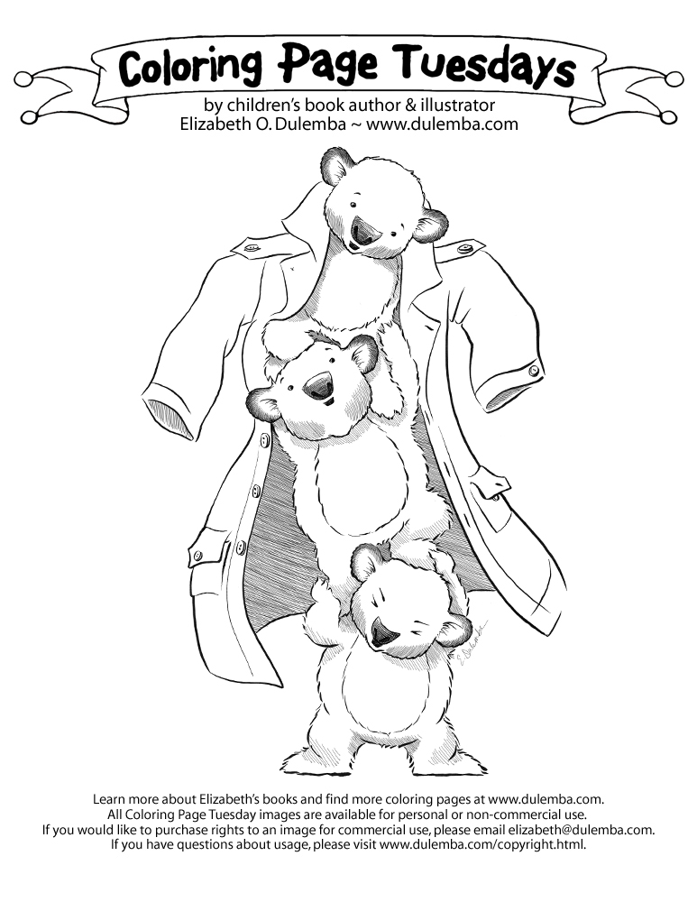
Coloring Page Tuesday - Koalas in a Coat

     It may be getting warm in the southern hemisphere, but in the northern hemisphere it's starting to get chilly! This was my #Inktober submission for "Coat." CLICK HERE for more coloring pages.
     Remember, I create my coloring pages to draw your attention to my books! For instance, I'm celebrating the new illustrated (by me) edition of A BIRD ON WATER STREET! My debut novel won me "Georgia Author of the Year!"
Booklist said it's "A book deserving of a wide readership, recommended for all libraries."
If my news and images add value to your life, won't you please
patron
Just love this one image? Consider a one-time donation...
     I create my coloring pages for teachers, librarians, booksellers, and parents to enjoy for free with their children, but you can also purchase rights to an image for commercial use, please contact me. If you have questions about usage, please visit my Angel Policy page.

Studio Drift's IMMERSED IN LIGHT

On our second day together, Stan watched Ody, it was really hard work...
Vicky and I headed to downtown Charlotte and The Mint Museum. This will take a few days to share, but I'll start with the amazing exhibit by Studio Drift. It was called Immersed in Light and was an amazing installation of sculptures, both static and kinetic, tactile and projected. Here's what they had to say about it (click the image to read larger):
This first piece was called Amplitude.
It was a breathtaking, moving sculpture that resembled a giant, flying centipede in a way, and that I could have watched for hours. In fact, I made a recording, so I can! CLICK HERE to watch it in motion on Youtube!
     Another installation was called "Fragile Future."
These were tiny brass boxes with dandelion puffs inside each one, and an LED light inside each puff.
I can't imagine the time that went into this stunning piece.
     Do look at their website as it gives you a walk through one of their complete exhibits including the ones I shared above.
     This next piece wasn't part of the Studio Drift exhibit, but it was all about light, so I'll share it here. It was called "Joy of Transition" by Ayala Serfaty and was made of glass filaments, a sprayed on polymer membrane, and lights. Wow.
I'll share more over the coming days, so come back to see!