Showing posts sorted by date for query Personal Color Palette. Sort by relevance Show all posts

Georgia Conference on Children's Literature

March 22-23 I was honored to provide a keynote speech and give a workshop at the 55th Georgia Conference on Children's Literature at my alma mater, the University of Georgia!
This is a well attended annual event held for librarians and educators across Georgia.
There were actually quite a few "keynotes": Me, David Bowles, Torrey Maldonado, Stacy Mcanulty, and Bob Shea.
My novel, A Bird on Water Street was a finalist for the Georgia Book Award many years ago, so it was an honor to be able to return!
     I love getting to know fellow creators. Here we are with the program organizers.
I gave a talk on "Maintaining Creativity Through Adversity" - something that has been on my mind of late for obvious reasons. And for my workshop, I talked about color theory and finding one's personal color palette.

     My parents actually drove up from Atlanta to attend - gratis. The organizers were so sweet and made them nametags and everyting. It was my mother's 80th birthday, so I asked the audience to give her a big "Happy Birthday!" She was tickled silly. That was happy.
     Also, Petros Panaou was one of the organizers and we ended up hanging out quite a bit in Bologna at the Book Fair there - small world!
     It was so good to be back in Athens again. A lot has changed, but much has remained the same. I have so many good memories there. It's so strange to see all the young adults, who rightly own the town now, creating magical memories of their own.
Stan and I both went to the University of Georgia, so it seemed only fitting that I should leave a bit of him there too...right by the arches.

He'd like that.

SCBWI Carolinas Conference!

Last weekend I had the great pleasure to speak at the Carolinas chapter of the Society of Children's Book Writers and Illustrators (SCBWI.org).
It was hosted at the Hilton Charlotte Airport, where I had a lovely suite to call home for a weekend! Can you say "writer's retreat"? I sure did! But first, on Friday, I gave a talk about "Color: Identifying Your Personal Color Palette" - a topic I'm beginning to get known for and received compliments for all weekend. It had great attendance, and as so often happens, several people reported that knowing their personal color palette changed their lives! No kidding, it can be that significant! I also gave a portfolio review, which is always fun, although, is never enough time.
     I didn't take nearly enough pictures of the weekend, and the photos I did take are terrible, so my apologies on not providing better visuals for this post. But that just wasn't what this weekend was about for me.
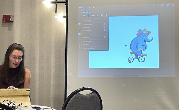
     I did attend some wonderful talks. For instance, my friend Ashley Belote talked about using Procreate.
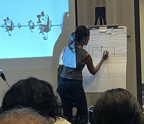
And LeUyen Pham, illustrator of over 100 books, who was also a lovely and dynamic person, gave one of the best talks about perspective that I've ever seen!
     But truly, being able to attend a conference again, in person, was such a JOY, I spent most of my time connecting and having wonderful conversations with people like Maya and Matt Myers, Stacy McAnulty, LeUyen Pham, Jake Burnett, Ashley of course, and Cinda Williams Chima in particular, or just hanging out in the lobby writing. (I finished two projects!) I wasn't trying to get published, or connect with the editors/agents/publishers - I already knew them and we all got to say "hi!" I wasn't trying to push my work because I already have enough to keep me busy for a lifetime (mostly mine and Jane's). So, I just got to relax and really enjoy myself and all the brilliant people attending the conferences - including some of my friends from Southern Breeze, my old SCBWI chapter - it was so good to see them! I even made connections with some amazingly talented people who I hope to invite to speak to my students sometime soon, like Caldecott-winner Gordon C. James, who, it turns out, lives in Charlotte!
     Truly, the weekend was all about people, and writing, and I didn't want it to end. But of course, that's why I so look forward to these conferences... I had such a great time!

Picture Hooks Festival of Illustration

I was thrilled to be invited to speak at this year's Festival of Illustration by dear friends Vivian French (author) and Lucy Juckes (agent). They run PictureHooks, the organization that was one of the driving forces behind my decision to move to Scotland for my MFA and PhD. "Picture Hooks provides opportunity and development for emerging picture book illustrators." I've been a long-time supporter and fan, so it was an honor to be included in this year's line-up.
     I gave a talk about Color Theory and finding your personal color palette. I was joined by several friends. Astrid Jaekel talked about collage and shared some wonderful new work from when she was stranded in the US at the beginning of the pandemic. Jonathan Gibbs, my MFA professor, shared his wry humor and wood carving skills. Other speakers were David Melling, illustrator and animator; Dr Sheena Calvert, artist and philosopher; Stephen Fowler, Senior Lecturer in Illustration at Worcester University; Stephen Fowler, artist, illustrator and printmaker and a Senior Lecturer in Illustration, Art & Design Communication at Worcester University; Tamlyn Frances, agent; Alice Sutherland-Hawes, agent; Philippa Milnes-Smith, publisher of such authors as Chris Riddell and Lauren Child; and a crew of folks who helped put the event together. (Special thanks to Siobhan Clark who put together the videos and was key to the event's success.)
     Visit the PictureHooks website and subscribe to learn about their future events.

Come Draw With Me at the York County Museum!

Saturday was the annual Come Draw With Me celebration at the Museum of York County. The museum has an astounding collection of African taxidermy animals with an interesting history. The story goes that a Rock Hill councilman was on a flight to Washington, D.C. and ended up sitting next to Maurice Stans. Stans had been on Nixon's re-election committee back in the 60s. He was a wealthy man and a big-game hunter, but he was getting old, and his children didn't want his collection. So, the two men parted with a handshake agreement that if York County would build a facility worthy of Stans' taxidermy collection, they could have it. Hence, the amazing collection in the wonderful museum.
     Now, however you feel about taxidermy, all of these beasties were acquired back in the 1960s. And whereas if they were still in Africa, they would have long ago turned to bones and dust, now they reside in a museum where children and artists of all ages can learn more about these amazing creatures and create art that disseminates a message of conservation to a wider audience. The museum embraces the positive, scientific, and artistic value of their specimens opening their doors to the community for free once a week and during the Come Draw With Me event, and it really is something special.
     They have displays that show the process of making taxidermy, both the beasties...

and the dioramas in which they sit on display.
     This year, forty artists signed up to come sit and draw whatever they wanted to concentrate on—anything from bugs to buffaloes. Many of the artists were Winthrop students. Here are (from the back) Joy, Noel, and Sierra.

Here's Josh drawing (he recently shaved his head and dyed his hair to one of the colors in his personal color palette - HA!)...

he was drawing this guy, a HornBill.

And here's David, in the zone.
     My predecessor, David 'Doc' Brown was integral in putting together this annual event, here we are together, mentor (him) and mentee (me).
Rather than draw, he introduced me around to artists from across Rock Hill who look forward to the event every year.
Artists such as Dr. Brad Sabelli, who showed everyone around...

before doing some painting of his own,

and illustrator Herb Dumaresq,
who gave an impromptu portfolio review to a recent Winthrop graduate, Lilly.
     In fact, several artists I met used to live in Pennsylvania or New York City as professional illustrators, but moved to Florida for retirement, found it too hot, and ended up half-way back in Rock Hill. It seems there's an artists' colony blooming here that I wasn't yet aware of, and with a supportive local council, more arts support is in the works. It's an exciting time to be in this fast-growing city.
     Certainly, it was thrilling seeing so many generations enjoying the same practice with equal intensity and mingling together over a shared passion. Truly, the event was an enormous hit! I mean, how often in life do you get the chance to draw while sitting in the shadow of a Giant Eland...

or standing nose to knee with a giraffe?
Maybe next year I'll actually sit and draw too - ha!

How Your Personal Color Palette Can Change Your Life

Recently, Stan and I went to a friend's new flat for lunch and to take pictures to help her advertise it on AirBnB. Olga purchased the flat just a few months ago and there were already some very cool features in place - orange shades, orange radiators (!!!), and some lovely tile and wooden floors. While we ate lunch, I set my artist's eye to pick out items that would go together to help stage the photos. My thinking was completely based on the lectures I give at Hollins University about Personal Color Palettes.
     As I looked around, I began to see particular colours repeated again and again in her favorite keepsakes. For instance, this poster by Daniel Richter.
This funny deep orange tin.
She'd also bought this fantastic fabric she'd had made into a bed coverlette.
We decluttered and then rebuilt the rooms, and as we did so, we decided which personal items would stay and go. For instance, out went the (very nice) flowered bed linens. They were busy and didn't fit in her color palette. Out went asundry items and in came some calming plants from the bedroom. I asked her to empty a wonderful big basket that picked up on the grey of the couch to go on the dining table - carrying the charcoal around the room.
Of course, the star was the orange. Olga had extra fabric from the bed throw. We wrapped a pillow in it (she's going to have official pillow covers made from it after our visit) to carry the orange through the flat from the shades, to the couch.
And into the kitchen where that funny orangey tin played a big role.
The whole idea of a personal color palette was a revelation to Olga (it's a revelation to everybody I share this with), and she grabbed her favorite dress to show me. It had orange and pink stripes, like the shades and the shirt she was wearing. I quickly pulled together some of her items to show her what I meant.
These are the colors that pull out:
What a groovy palette! The black and charcoal act as bases - colors for ground pieces like the couch and the dining chairs, which we swapped out from the larger wooden chairs as that black helped pull the color around the room. In fact, she had been thinking about painting the wooden chairs black and after our visit, is confident it will look great! The other colors will help her make purchases in the future. As long as she sticks to the same saturation level, these will always go together and give her flat a lively, colorful, cohesive look! She'd already been doing it subconsciously, now she can do it consciously!
So, Olga's flat is now advertised on AirBnB for rentals when she's out of town (click the image above to learn more), and she has a fun new way of looking at and decorating her world! What a creative and fun afternoon!
     Flat Photos by Stan Dulemba

Personal Color Palettes at Hollins

I've written about this before. It's a test I run my students through each year, to discover their personal color palettes, and it's spooky how well it works. We figure it out through two primary approaches. First, students identify books that use their fave colors. They pull th epalette out with painted or color penciled swatches. Here's Deanne's work-in-progress.
Once they've done this, we move to the colored pencils themselves. I ask them to choose 3 to 5 pencils that they think are their favorite colors. And then 3 to 5 that represent the colors they wear most often (or surround themselves with in their decorating choices). And finally, we pare it down to the colors that show up in their artwork most frequently.
      This consistently works to help students come up with about 3 to 5 colors that define their personal color palette. And it usually freaks them out to see colors that have so dominated their lives on a subconscious level, brought to a conscious level, where they can use them consciously to help define their personal illustrative styles.
     Here's how it worked for my students. Here is what Deanne came up with.
     Caitlin pulled together several book covers to narrow down her color palette. It becomes obvious when you see all the covers together.
     Andrea found her exact color palette in swatch form in a book she's using as a mentor book (one that is helping to inspire and inform her final work).
     It's my favorite activity to do with my students as it always works, and is such a revelation that can really make a strong difference in a creator's process.
     Curious about MY color palette? I wrote all about this process and my own colors year ago at https://dulemba.blogspot.com/2008/06/office-redo.html.

Hazel Dunn on color palettes

I am such a geek about color palettes and personal color palettes. I teach it to my design students and have them do exercises to find their own. So, it's lovely to find someone else as crazy about color palettes as I am - Hazel Dunn. During the PictureHooks workshop last week, she shared a collection of color palettes she put together. First, she takes an image she especially enjoys, then she breaks out the color palette from it, like this:
You can see how she breaks out the colors in alignment with where they appear in the image.

She had about 15 of these, which she bound together in a booklet. At the back of the book was a collection of the colors she chose, creating a thorough and referencable personal color palette.
For individual projects, she also did color studies, which she again collected in a little book.
In this study, she placed colors on top of each other to make sure they worked together. It's also a great way to make sure the values aren't the same and none of the colors are vibrating as a result of fighting for dominance.
More brilliant take-away ideas from this so-called beginner. I love it!

Screen Printing at the ECA!

The piece I created for our museum trip inspired a completely new project. I've been wanting to get into the print lab to experiment with screen printing and this project created the perfect opportunity. Here was the inspiration piece again:
I decided to create a series - using gouache and india ink on heavy tracing paper to create marks and write some of my favorite quotes.
I gave these paintings to the print department and they had the screens burned (that takes a day to turn around). The next day, I headed over for a private induction session with Mark Fenning again. (He's the one who walked me through relief printing a few weeks ago.) It's a nice set-up!
I mixed colors using my personal color palette. Then I made several experimental mark prints (I'm calling them splotches). I did some in straight color, and some layered with transparent ink. I'll go back to create more versions. (I couldn't do all the paint colors at once.)
     Then I printed one of the quotes onto some of the prints. I'll mix and match these more too.
I set them on the rack to dry as I finished them.
I'll show you the finished pieces soon, but first, I'll do more experimenting. For now, this is all about process and trying new things!
     Well, sort of new things. I'd forgotten that we used to screen print all the clothing samples when I worked at an apparel company in my early career. I used to love going home with paint up to my elbows - it makes me feel like an artist! (Have you noticed I'm feeling a lot more of that these days?)